The Day I Discovered Preset White Balance
White balance is the term used in photography to describe either the particular tint that your (intended to be) white lights are, or the camera settings to bring it back closer to pure white. And today, I have something cool… about shifting light source colors. Nice, I guess?
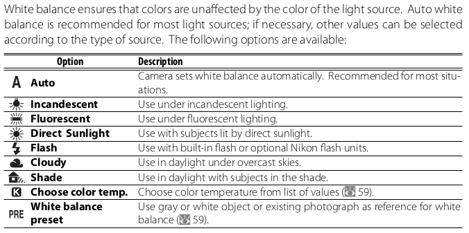
Now, my particular camera, the Nikon D80, has a few modes for white balance, which I can take a picture straight off the manual to show:
Of these, auto usually does a good enough job if I don’t want absolute perfection, and post-processing the raw file will get it the rest of the way.
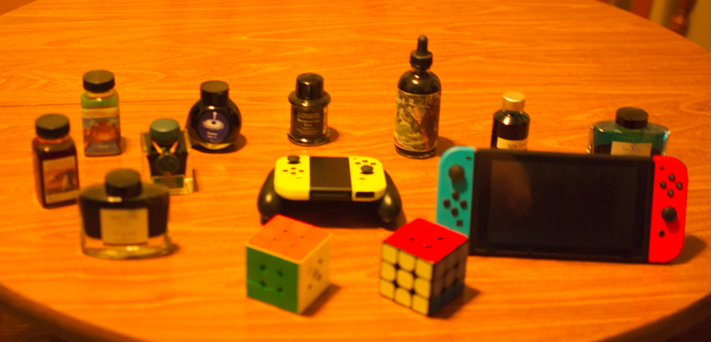
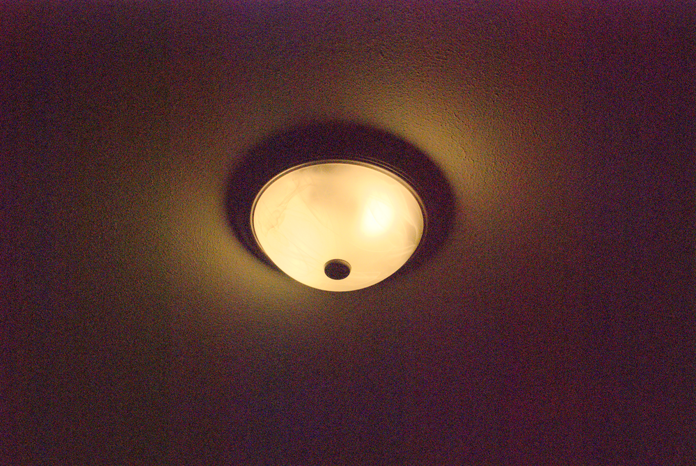
When I take a picture under my house lighting, this is the result:

That’s… okay, but I think we can do better without even leaving the camera. For example, let’s switch from auto to the actual type of lights I use:
Cool, that’s a small improvement. If you want examples of what not to do, here I set it to cloudy, which means it’s expecting a blue tinted light not yellow:
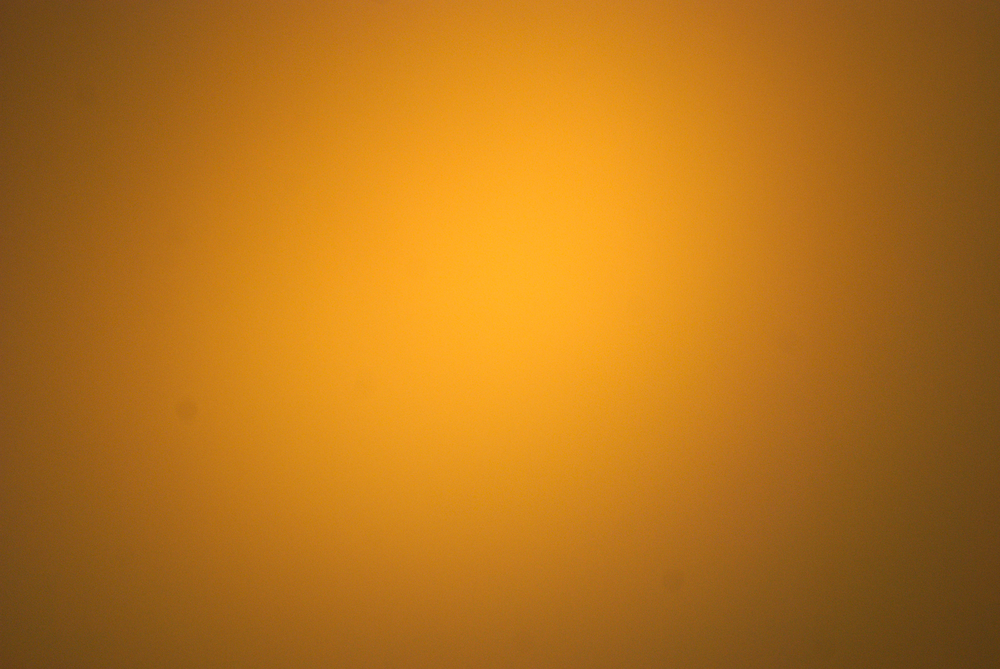
Yeah, let’s just… not. Also, did you notice that one of the options there was color temperature? This setting allows you to pick from, on this camera, 2500 Kelvin to 9900 Kelvin as the temperature (color, not real!) of your light source, which it will correct for. Because the higher the temperature, the cooler (more blue) the color, setting this number lower results in a bluer photo, and higher results in a yellow photo, the opposite of the light source it’s expecting. The first photo is 2500K, the second is 9900K to show the extremes:
But there’s one more mode.. preset.
Preset allows you to take a picture of a white or neutral gray object under your desired light source, and the tint from this photo will be taken and processed.. subsequent photos will have the opposite effect applied, in theory bringing the apparent color of your light to a true white.
Now I could go and find a white object, or print out an entire sheet of paper with a neutral gray on it, but neither of those guarantee good results. Luckily, there is a specialized piece of kit for this: a white balance lenscap:
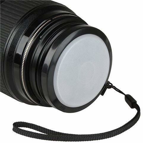
It’s basically a semi-transparent white plastic sheet with threads on it. It’s a neutral color, and acts like a big diffuser, severely blurring the photo and really only just getting the average color. Well, I can put this on and then take a picture of the light, meaning said picture will be tinted — the same processing can be run on it to calibrate future pictures.
This is what the light looks with no significant white balance, through the cap, and after applying that photo as preset WB: (you’ll have to excuse the noise, it doesn’t like taking direct photos of lights.. as I’d expect)
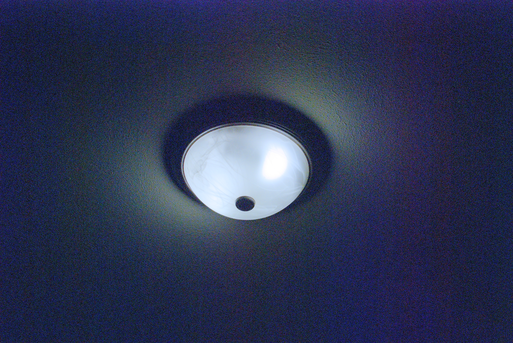
Now it does look like it’s over-correcting a little, ideally that final photo should be pure white, not have a little hint of blue, but it brings it much closer to something neutral that I can fix up in post.
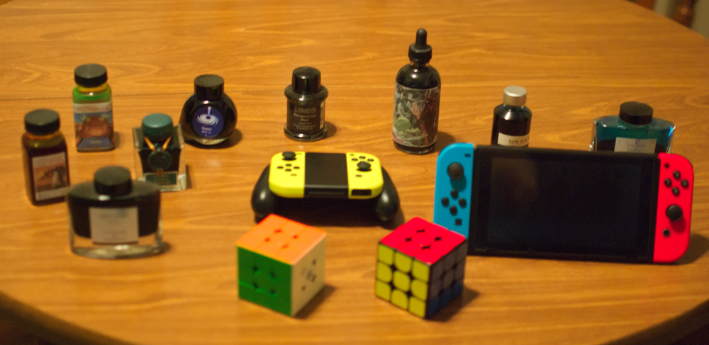
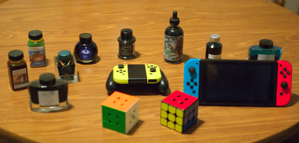
However, look at how that changes an actual photo:
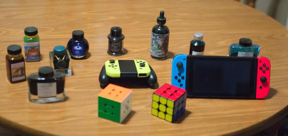
I swear I didn’t edit that one.
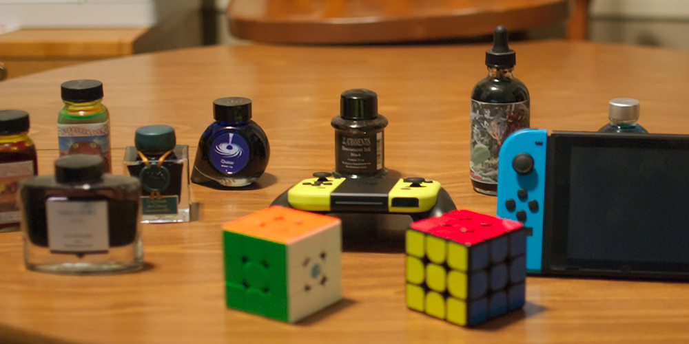
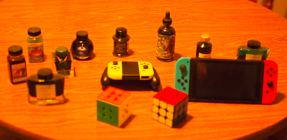
Just for comparison, here’s the auto one again:
That’s… quite a difference. Sure it’s not as easy as just telling the camera “you figure this one out,” but the extra.. what, minute of time it takes to calibrate leaves me with much more neutral shots, ones that I’d consider presentable with only a quick touch-up to bring the overall color more in line with what I’m trying to showcase. The header image up at the top is an example.